
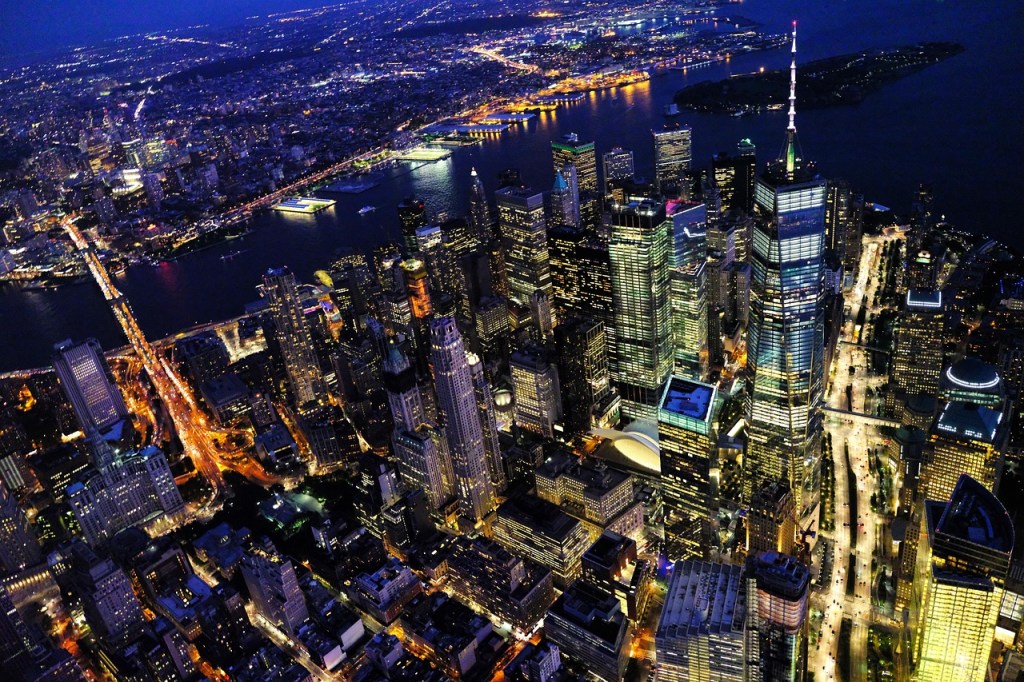
When designing the cover for Reunion: Coda, I wanted something that felt unique yet true to the story within. After much deliberation, I made the bold choice to leave the front cover free of text—no title, no name, just the striking image of New York City at night. Here’s why.
First, NYC at night isn’t just a setting; it’s a mood, an atmosphere, and almost a character in itself. The vivid lights, the depth of the shadows—they speak volumes, evoking themes of mystery and discovery. For me, the photo alone conveyed everything I wanted readers to feel before even opening the book.
Second, the decision was both practical and artistic. I experimented with different text placements and colors, but no matter the combination, the text seemed to blend into the image. It wasn’t working—and rather than compromise the art by overlaying fonts that felt forced, I embraced the simplicity and clarity of a text-free design.
Lastly, this choice reflects the book’s spirit—a quiet invitation to approach and explore. The spine carries the title and my name for those seeking confirmation, but the front whispers instead of shouts. It’s a design decision that mirrors the story itself: sometimes the most powerful moments are the understated ones.
I hope readers enjoy this small, intentional detail as they begin their journey into Reunion: Coda. Thank you all for your support—it’s truly appreciated.

Comments
4 responses to “Behind the Cover: Why I Chose a Text-Free Front for Reunion: Coda”
Good choice, Alex!
LikeLike
Thanks, Paul.
The book should be available for ordering tomorrow.
LikeLiked by 1 person
Great, Alex. I’ll let you know when I get a copy. I’ll write another review, if you so desire. Thanks for the heads up.
LikeLiked by 1 person
A review is always welcome (and needed, and much appreciated)!
Thanks, Paul!
LikeLiked by 1 person