Sunday, October 12, 2025
📍 Orlando, Florida
A Chilly Morning and a Familiar Ritual

This morning greeted me with an unexpected chill—low 60s, which, by Florida standards, qualifies as brisk. The sun had barely crept over the horizon when I stirred, debating whether to return to sleep. Light tends to sabotage my rest once it hits a certain threshold, so I gave up the fight, ambled into the kitchen, grabbed a blueberry muffin, and brewed a cup of Maxwell House instant coffee. Not glamorous, but effective.
Wrestling with Kindle Create

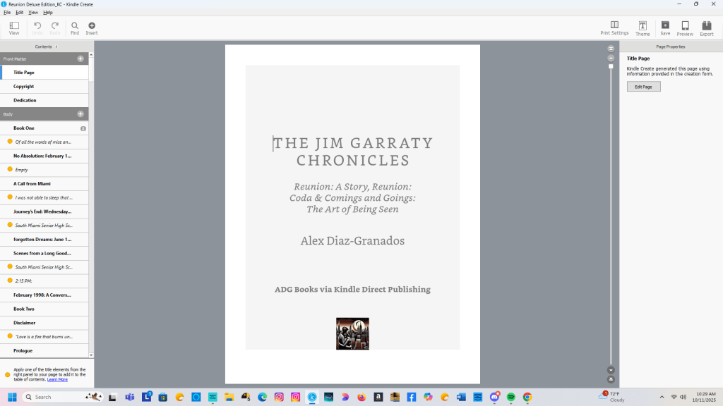
Yesterday was a rare Saturday workday. I usually stick to a five-day writing schedule—writing is what I do best, and I can’t imagine not doing it—but the grind is real, especially when you’re wrangling with Kindle Create. That app, bless its intentions, has a knack for testing my patience with formatting quirks that feel more like design oversights.
I’m currently working on the omnibus edition of The Jim Garraty Chronicles, which will collect Reunion: A Story, Reunion: Coda, and Comings and Goings – The Art of Being Seen into one volume. It’s a project I believe in, but ambivalence creeps in when I open the file and face the sea of chapter titles and subheadings that need fixing before I can move on to the next phase.
Formatting Frustrations and Dual Timelines
Back in early 2023, while preparing Reunion: Coda for its eventual April 2025 release, I encountered the same issue: Kindle Create’s formatting logic seems more concerned with font aesthetics and “ease of use” than with proper capitalization. If you’re a writer who uses subheadings to orient readers—especially in dual-timeline narratives like mine—it’s maddening.
I rely on descriptive chapter titles and subheads to guide readers through Jim Garraty’s layered storylines. Microsoft Word handles this beautifully. Kindle Create? Not so much. Despite its 90% compatibility with Word documents, it stumbles on basic style conventions—like capitalizing every word in a book title (Comings And Goings – The Art Of Being Seen) even when that’s stylistically incorrect.

Worse, some of these formatting faux pas are baked into the app’s templates, making them difficult to override. As a writer and former copy editor, I find this especially exasperating.
Momentum vs. Misgivings
When I worked on Reunion: Coda, my enthusiasm carried me through the formatting headaches. I was building something readers had asked for—both publicly and privately—and that sense of purpose helped me push past the app’s limitations. I manually formatted each chapter title and subhead, even if it slowed me down. It wasn’t as disruptive as my moves to and from New Hampshire in 2023 and 2024, but it did sap energy.
Now, with The Jim Garraty Chronicles, I’ve been less diligent. I’ve set a December 1 deadline for a Holiday Season release, and while I still believe in the project’s emotional coherence and thematic unity, I’m not sure others share that belief.
Sales of Reunion: Coda and Comings and Goings haven’t been stellar, despite early interest. So I ask myself: is it hubris to think a deluxe edition will resonate more deeply?
Duty Over Excitement
Yesterday’s work on Reunion: Coda felt more like obligation than inspiration. I wasn’t driven by excitement—I was honoring a commitment. Still, I’m pressing on.
Comings and Goings has fewer subheadings, and Reunion: A Story is already properly formatted. The path forward is clearer now, and I’ve decided to finish the omnibus edition, even if it feels quixotic.
Because maybe—just maybe—there are readers who want Jim’s story in one place. And maybe the act of finishing it, despite misgivings, is its own kind of emotional truth.

You must be logged in to post a comment.